After blogging yesterday about the terrible election graphic of the map doing the rounds on social media, a new terrible graphic has appeared on social media. It is on the Evolve Politics Facebook page.
What’s wrong with it?
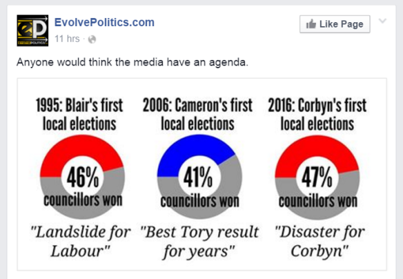
First, it is using a form of pie chart instead of a bar chart, which would be a much better way to represent the data (but that’s another story). The main problem is the metric it measures is not at all fit for purpose.
The implication from the graphic is that compared to Cameron’s and Blair’s first year in the leadership job, Corbyn did better. What we have here is a false comparison. As with my last post I’m not going to comment on whether the results are vindication of Corbyn’s leadership or not, I will solely restrict myself to the good use of data.
Before I explain the false comparison I want to point out it says 47% of councillors won – that is nonsense as most Labour councillors defending their seats won. I am assuming it means”47% of council seats were won.
So why is the comparison false?
At each set of local elections only some councils are up for election and in many cases they are not “all out” elections, but only some seats are up. If you want to see the council electoral cycles go to the government website here for a list.
So when council seats are up for election across the country they could be in more Labour voting areas, or conversely in more Conservative voting areas. Hence comparing years like this is meaningless as it is not clear that the electoral cycles are the same, and in any event there have been significant changes in electoral cycles (and types of councils) since 1995.
The percentage of councillors elected for any political party is therefore not a good measure of success (or failure). And neither is it useful as a comparison over different years.
The best metric to use to determine overall performance is the change in seats. In this election Labour has a net loss of 18 seats and the Conservatives had a net loss of 47 seats. I will leave it to you to interpret this as good, bad or indifferent for Corbyn. For more info on the results go to the Guardian website here.
Alternatively you can look at National Equivalent Vote Share to get a good idea of how a party has performed. This article by Tony Travers of the LSE explains it very well. Note the article was written before the elections so it not biased for or against any party.
Here are some pointers for you all when looking at data and graphics (political or otherwise) to help you determine the useful from the crud:
- The graphic should have its provenance on it. I always put a little logo with my Twitter handle on it on my graphics. That way people know who has done it and can track me down if they think I’ve got it wrong or want to ask questions. Not having the provenance on it doesn’t mean the graphic isn’t correct, but it should set alarm bells ringing.
- The graphic should say where the data was sourced from, with a link to the data if at all possible. Again I always try to put the data source on it on my graphics. That way people can track down the data and check my graphic is correct. If you cannot track down the data that created the graphic, then be very wary.
- If some significant calculations or data analysis is required then there should be a link to the spreadsheet or other analysis that was done so it can be checked. Remember the study by highly respected academics Reinhart and Rogoff, that purported to prove austerity worked; it turned out to have a spreadsheet error that made their conclusions invalid. It was only because they made their spreadsheet available that this error was spotted.
- If the graphic purports to compare things – ask yourself is it a fair or false comparison?
- If the graphic proves what you want it to, remember confirmation bias and ask yourself if you are believing what you want to believe. Ask yourself if it proved the opposite of what you wanted, what would be your criticisms of the graphic. Then ask why these criticisms aren’t valid even though the graphic proves what you want.
- It if looks too good to be true, it might well be.
We do ourselves no favours if we fool ourselves. The title of this blog is a nod to something the late, great physicist Richard Feynman once said, and another wise thing he said is:
the first principle is that you must not fool yourself – and you are the easiest person to fool
So be careful around those graphics and don’t fool yourself.

It measures the percentage success of those that stood and the press reaction to it. Whether they were more or less marginal would probably be lost on the media. The difference would not be that great in any case; most seats are not marginal. The difference in the reporting, however, was very great.
LikeLike
And as is pointed out in the blog, there is nothing in that graphic that can help you understand (one way or another) if the difference in reporting was justified or not.
LikeLiked by 1 person
Pingback: Corrected version of a dodgy election graphic | More Known Than Proven
Actually Labour has only lost 11 councillors, the Tories 49. Also Labour has a net loss of zero councils, while the Tories have a net loss of one.
LikeLike
Thanks for that correction. I think the figures I used were correct as of about 18:00 on Friday. There were a few more results to come in and I guess they have no been updated.
LikeLike
Excellent job, thanks for this. Very minor moan: maybe you should reword this logic gap (and typo): “Note the article was written before the elections so it not biased…”.
I’m sure articles written before the elections are just as prone to bias as those written afterwards.
LikeLike
Pingback: Local Election Performance | In Defence of Liberty
Pingback: Another dodgy political graphic | More Known Than Proven
Pingback: How to make a political graph properly | More Known Than Proven