Jeremy Corbyn won the Labour leadership election yesterday with 62 per cent of the vote. Congratulations to him on a convincing win. On social media there has been a lot of chatter about how that his margin of victory would have been much larger if the deliberate purge of his supporters had not happened.
I’ve seen some very high figures bandied about, some vent suggesting well over 170,000 people were prevented from voting. This seems like a very high figure so I thought I’d dig around to see what numbers I could find. I am not going to get into the rights and wrongs of decisions of the NEC to suspend or expel people – I solely want to make an objective assessment of the scale of those prevented from voting.
First, I want to start by quoting my sources for this analysis. Given that it is Corbynites who are claiming there has been a massive purge I will quote data I have sourced by two prominent Corbyn supporters. One is NEC member Christine Shawcroft who has a long track record of being on the left of the party and she is a prominent Corbyn supporter. Using Christine as a source has the added benefit because as an NEC member she has access to data other people may not get and she has kindly published it on Facebook. The other source is MP Richard Burgon who is in the Shadow Cabinet and other prominent Corbyn supporter.
Now let’s look at the suspensions. For reasons of brevity when I refer to “suspensions” I actually mean “suspensions and expulsions.”
Suspension from the party because of complaints about abusive behaviour, membership of a proscribed organisation, support for another party etc. A final reason for suspension is (and I paraphrase many Corbynites) “suspension for some ridiculous reason to deliberately purge Corbyn supporters.”
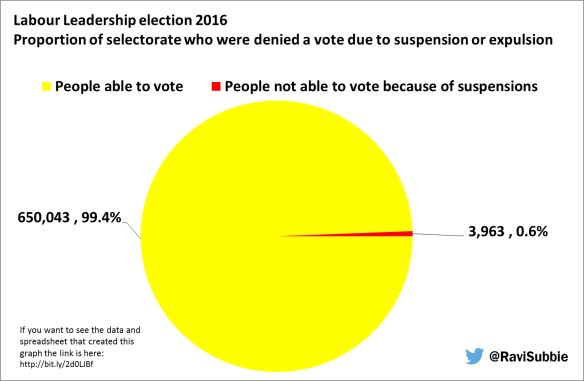
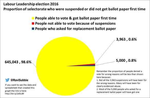
According to a post on Richard Burgon’s Facebook page there were 654,006 ballot papers distributed. And according to a post on Christine Shawcroft’s Facebook page 11,250 complaints were put in. Over half of them were discounted. The 11,250 complaints represents 1.7 per cent of the selectorate for this election.
As Christine herself notes “If I was trying to conduct a purge of Party members or supporters, I wouldn’t dismiss half the complaints.” In fact two out of every three complaints were dismissed.
She goes on to say “of all the complaints, 3,963 led to suspension and expulsion.”
The total number of suspensions and expulsions amounts to 0.6 per cent of the selectorate for this election.
If some of the reports of individual accounts of suspensions are correct then it certainly looks like the wrong decision was made and they are likely to be successfully appealed. But there can be no doubt many of them will be reasonable. You only have to look at the pro-Corbyn Labour Abuse and anti-Corbyn Gentler Politics twitter accounts to see the reports of abuse. Abusive behaviour is definitely happening.
There is no way determining if the suspensions were disproportionately aimed at Corbyn supporters or how many will be successfully appealed but we can say for sure they only amount to 0.6 per cent of the selectorate and not all of this 0.6 per cent were Corbyn supporters, and not all of them will be successfully appealed.
Given this evidence, the idea that there has been a systematic purge of the selectorate using suspensions that disproportionately impacted on the result is plain wrong. So, if after reading this blog, you are still promoting this idea you are wilfully spreading disinformation and being divisive.
Although I’m not really a fan of pie charts (see here for why) I think I pie chart illustrates my point well (I will admit they do have their very occasionally – usually when there are only two categories).